Mythic Minis is reader-supported. When you buy through our affiliate links, we may earn a small commission—never costing you anything extra. Your support helps us keep creating helpful painting guides and hobby resources for everyone.
Introduction: Why Colors Matter in Miniature Painting
When it comes to painting miniatures, color choice is one of the most critical aspects of the process. The right color scheme doesn’t just make your model look impressive—it tells a story, captures the mood, and enhances the overall theme of your miniature or army. Whether you’re painting a fierce Warhammer 40K Space Marine, a delicate Dungeons & Dragons character, or a stunning display piece for your collection, choosing colors thoughtfully can take your miniatures from good to extraordinary.
But for beginners, selecting colors can feel overwhelming. How do you pick shades that work well together? Should you stick to the faction’s lore or branch out with your own ideas? And what if the final result doesn’t turn out how you envisioned? These are all common challenges faced by new hobbyists and even experienced painters.
In this post, you will learn how to conceptualize a color scheme for your model kit. You will learn basic color theory and how to choose colors for painting miniatures and model kits.
In this guide, we’ll demystify the process of choosing colors for miniature painting. By understanding basic color theory, exploring different types of color schemes, and avoiding common pitfalls, you’ll gain the confidence to pick the perfect palette for any project. Whether you’re aiming for bold, eye-catching contrasts or subtle, harmonious tones, the techniques in this article will help you bring your miniatures to life.
Understanding Color Theory for Miniatures
Color theory is the foundation of any great paint job. It’s not just about picking colors that you like—it’s about knowing how different hues interact to create contrast, harmony, and visual impact. Understanding these relationships helps you make deliberate choices, whether you’re painting a single character or an entire army.
The Basics of Color Theory
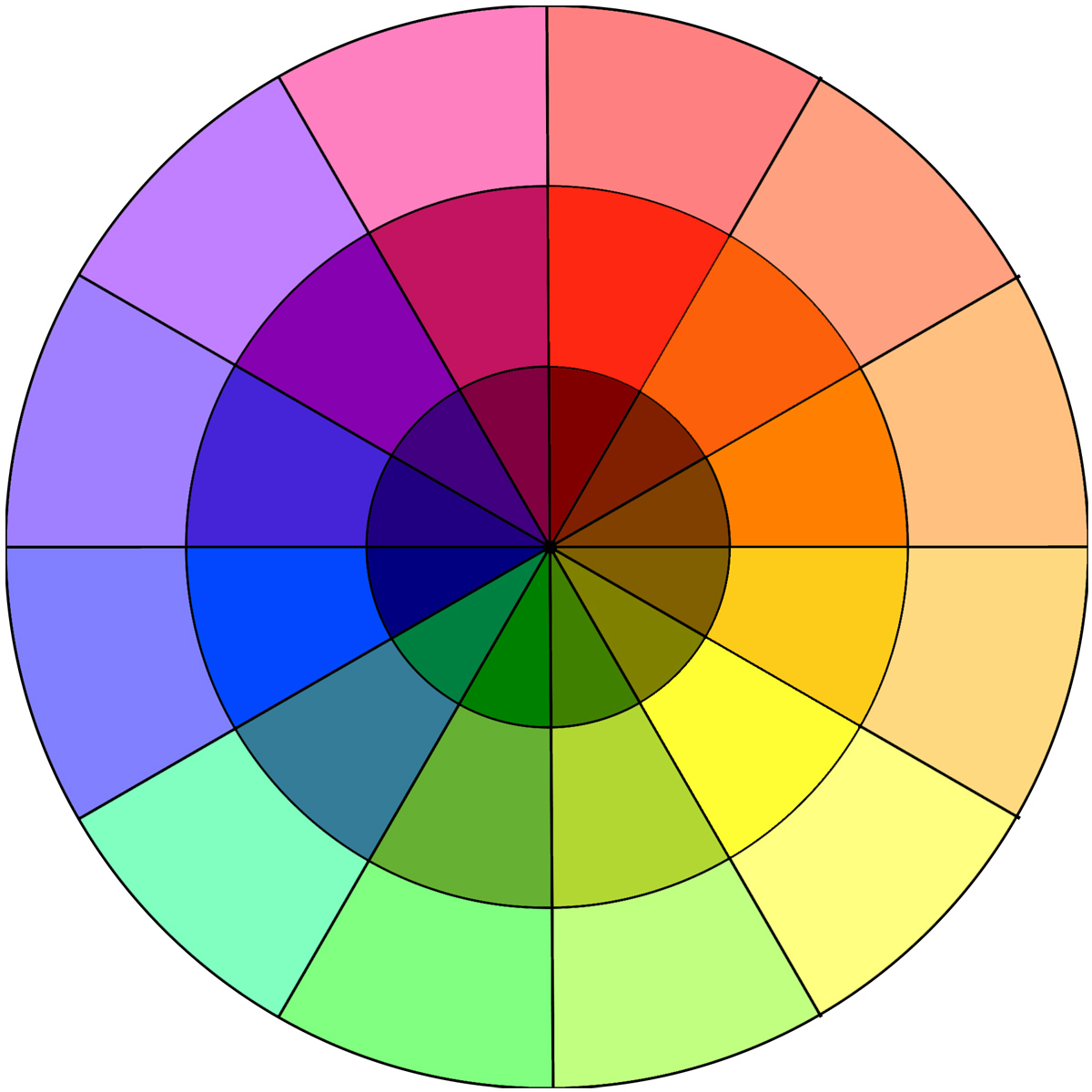
At the core of color theory is the color wheel, a visual representation of primary, secondary, and tertiary colors. Here’s how these categories break down:
- Primary Colors: Red, blue, and yellow. These are the building blocks of all other colors.
- Secondary Colors: Green, orange, and purple. These are made by mixing two primary colors.
- Tertiary Colors: Yellow-green, blue-green, red-orange, etc. These are created by combining a primary and a secondary color.
Understanding these categories helps you experiment with blends and gradients, especially when working with translucent or layered paints.
Color Relationships and Schemes
The color wheel isn’t just about identifying hues—it’s also a tool for finding color relationships. These include:
- Complementary Colors: Opposites on the color wheel, such as blue and orange. These combinations create strong contrast and make models pop.
- Example: Painting a fiery red dragon with green accents to create a striking, dynamic look.
- Analogous Colors: Colors that sit next to each other on the wheel, such as blue, blue-green, and green. These create harmonious and natural-looking schemes.
- Example: Using soft blues and greens for a serene forest ranger or water-themed miniature.
- Triadic Colors: Three colors spaced evenly around the wheel, such as red, yellow, and blue. These schemes offer balance and vibrancy.
- Example: Creating a bold and dynamic effect for a sci-fi faction’s armor or uniforms.
Warm vs. Cool Colors
Colors can also be categorized as warm or cool, which affects the mood of your miniature:
- Warm Colors (reds, oranges, yellows): Energetic, intense, and bold. These are ideal for emphasizing aggression or heat, like fire or lava bases.
- Cool Colors (blues, greens, purples): Calm, subdued, and soothing. These are great for creating a sense of mystery or frost, such as for undead or water-based models.
Using Neutrals and Accents
Don’t underestimate the power of neutral tones (black, white, gray, and earthy browns). These colors help balance brighter hues and can serve as a backdrop that allows your primary colors to shine. Adding small accents—like a splash of bright red on a black-and-white miniature—can draw attention to key details without overwhelming the piece.
Practical Application of Color Theory
To apply these principles, consider the purpose and personality of the miniature you’re painting:
- Are they a heroic character? Use bold contrasts to make them stand out.
- Is it a grimdark setting? Stick to muted, desaturated tones.
- Painting multiple miniatures for a single faction? Use a cohesive palette to tie them together while incorporating unique details for individuality.
By grasping these fundamentals of color theory, you’ll be better equipped to choose colors that enhance your miniatures’ appearance and convey their story. In the next section, we’ll explore specific strategies for selecting a color scheme that works for your models and your artistic vision.
Choosing a Color Scheme for Your Miniatures
Once you’ve grasped the basics of color theory, the next step is selecting a color scheme that fits your vision for the miniature. A well-chosen scheme not only enhances the visual appeal of your model but also sets the tone for its story, faction, or lore. Here’s how to choose a scheme that’s both creative and practical:
Match the Theme or Setting
The theme or narrative behind your miniature can guide your color choices:
- Fantasy Models: Earthy tones, rich jewel hues, or ethereal pastels work well for fantasy settings. For example, elves often suit greens and golds, while undead models may look best in muted, decayed tones like purples, grays, and pale greens.
- Sci-Fi Models: Bold, clean colors with sharp contrasts are common in sci-fi miniatures. Think about sleek armor with bright highlights or glowing effects to suggest futuristic energy sources.
- Faction-Based Choices: Many tabletop games, like Warhammer or Star Wars Legion, have factions with defined color palettes. These can be a starting point, but you can always tweak them to make your army unique.
Start with a Dominant Color
Begin by choosing a dominant color that defines the overall look of your miniature or army. This color should reflect the miniature’s personality or the theme you’re aiming for. Examples include:
- Blue for a calm, noble character.
- Red for aggression and intensity.
- Black or gray for a grim, stealthy aesthetic.
Once you’ve picked your dominant color, you can build a supporting palette around it.
Balance Main, Secondary, and Accent Colors
A good rule of thumb is to use the 60-30-10 rule:
- 60% Main Color: The primary color used for the largest areas, such as armor or robes.
- 30% Secondary Color: A complementary or harmonious color used for secondary elements, like trim, accessories, or weapons.
- 10% Accent Color: A bold or contrasting shade that draws attention to key details, such as eyes, gemstones, or glowing effects.
For example:
- A high elf model might feature 60% white (robes), 30% gold (trim), and 10% blue (jewelry and accents).
- A Space Marine could be 60% dark green, 30% silver, and 10% red for spot details.
Experiment with Bold vs. Subtle Schemes
Some miniatures benefit from bold, eye-catching schemes, while others shine with a more subtle approach:
- Bold Schemes: Use high-contrast colors, such as blue and orange, or bright, saturated tones for a striking appearance. These are perfect for heroes or centerpiece models.
- Subtle Schemes: Use analogous colors (e.g., shades of green and blue) or desaturated tones for a cohesive, understated look. These are ideal for armies or background characters.
Customize Existing Lore-Based Schemes
If your miniature comes with a predefined color scheme, such as a Warhammer 40K faction or a Dungeons & Dragons character archetype, don’t feel limited by it. Customizing an existing scheme can make your models stand out while keeping them recognizable. For example:
- Use the faction’s main color but swap out the secondary or accent colors.
- Add freehand details, like sigils or patterns, to personalize the design.
- Experiment with weathering effects to create a unique “battle-worn” appearance.
Draw Inspiration from Real-World Sources
If you’re struggling to come up with ideas, look to nature, art, or pop culture for inspiration:
- Nature: Use the vibrant hues of a tropical bird or the muted tones of a forest floor as inspiration.
- Art: Classic paintings can inspire dynamic color combinations. Look at how light and shadow play with color in works by the old masters.
- Pop Culture: Borrow schemes from movies, comics, or video games. For example, a black-and-yellow miniature inspired by Batman or an ice-themed palette from a fantasy film.
Consider Practicality
Some colors are easier to paint than others. For example:
Neutral schemes can save time, as they don’t require as many layers to achieve good coverage.
Bright yellows, whites, and reds can be tricky to apply smoothly, especially over dark primers. Consider using a white or light gray undercoat to make these colors pop.
Metallics and translucent paints require different techniques, so keep their complexity in mind if you’re a beginner.
Tools and Resources for Choosing Colors
Color Generators and Palettes
Online tools designed for artists and designers can be incredibly helpful for miniature painters. They allow you to create harmonious palettes, experiment with combinations, and even preview how colors interact. Here are a few popular options:
- Coolors: This color palette generator lets you create and explore endless combinations. Start with one color and see what complements it, or use a pre-designed palette for inspiration.
Check out the Coolors Color Palette here! - Adobe Color Wheel: An advanced tool that allows you to generate schemes based on color theory principles like complementary, analogous, and triadic relationships.
Check out Adobe Color Wheel here! - Paletton: Great for experimenting with balance and contrast. You can visualize how different tones and hues work together. There’s a neat option to add a complementary colors to your monochromatic, adjacent, and triadic color schemes. You can see examples of applications including what a sample website might look like, abstract designs and patterns, and even animations of your created color scheme.
Check out Paletton here! - Canva Color Palette Generator: Upload an image or piece of artwork, and Canva will extract a color palette you can use for your miniature.
Check out our article: 5 Best Tools for Choosing Colors and Painting Miniatures for more detailed information and links to color palette generator resources.
Painting Apps for Miniatures
Dedicated miniature painting apps can take the guesswork out of choosing colors. They’re often tailored specifically for hobbyists, offering tools like virtual painting or paint conversion charts:
- Citadel Colour App: Designed for Warhammer painters, this app includes a library of official Citadel colors and suggests combinations for base, layer, and highlights.
- PaintRack: A powerful tool for managing your paint collection and finding matching colors across different brands.
- MiniPaints: A similar app that helps you keep track of paints and match them to popular ranges like Vallejo, Army Painter, and Citadel.
These apps are great for planning a project, especially if you’re working with specific paints or brands.
Common Mistakes to Avoid When Picking Colors
Choosing colors for your miniatures is as much about avoiding pitfalls as it is about embracing creativity. Even experienced painters occasionally fall into traps that can make a scheme less effective. Here are the most common mistakes and how to sidestep them.
Overcomplicating the Color Palette
While it’s tempting to use a wide range of colors to showcase your creativity, too many colors can overwhelm the miniature and create a chaotic appearance. Stick to the 60-30-10 rule (dominant, secondary, and accent colors) to maintain balance.
- Why It Happens: You may feel compelled to use every paint in your collection or represent every detail with a different color.
- How to Avoid It: Before painting, decide on a cohesive palette and apply it consistently. Save elaborate details for centerpiece models rather than rank-and-file troops.
Ignoring Contrast
Miniatures with poor contrast can look flat and uninteresting on the tabletop. Without enough variation in light and dark areas, details may be hard to distinguish, especially from a distance.
- Why It Happens: New painters often focus on individual colors without considering their overall brightness or value.
- How to Avoid It: Test your palette in grayscale (using a photo filter or black-and-white mode) to ensure you have a mix of light, medium, and dark tones. Use washes, highlights, and shading to enhance contrast.
Forgetting the Base
The base of a miniature is often an afterthought, but it plays a significant role in tying the whole model together. A mismatched or overly bright base can clash with the miniature, ruining the overall effect.
- Why It Happens: Painters focus so much on the model itself that the base becomes a rushed or random addition.
- How to Avoid It: Plan your base colors alongside your model. Choose neutral tones or complementary colors that enhance the scheme without drawing attention away from the figure.
Overlooking Cohesion in Armies
When painting multiple miniatures, inconsistency in color schemes can make the group feel disjointed. While individual creativity is important, a unified look ensures the models belong together.
- Why It Happens: Painters experiment with different schemes for variety but fail to tie them back to the overall theme.
- How to Avoid It: Establish a core palette for the entire army. Even when experimenting with variations, ensure every model includes at least one or two colors from the main scheme.
Painting Without a Plan
Starting without a clear idea of your color scheme can lead to indecision, mistakes, and a model that doesn’t look cohesive.
- Why It Happens: You may want to dive into painting quickly without spending time planning.
- How to Avoid It: Sketch out your ideas, test combinations on spare models, or create a small mock-up using digital tools. A little prep work saves time and frustration later.
Overuse of Metallics or Special Effects
While metallics, neon paints, and weathering effects are striking, overusing them can distract from the overall scheme.
- Why It Happens: Painters may get excited about these effects and apply them too liberally.
- How to Avoid It: Use special effects sparingly to highlight key areas, such as weapons, armor, or glowing runes.
Conclusion: The Power of Thoughtful Color Choices
Choosing the right colors for your miniatures is a creative journey that combines artistic instinct with a bit of planning and practice. A well-chosen color scheme not only brings your models to life but also tells a story, enhances the tabletop experience, and reflects your unique style as a painter. Whether you’re aiming for lore accuracy, bold experimentation, or striking visual contrast, the steps and tips shared in this guide can help you achieve your vision.
Remember, there’s no single “right way” to paint a miniature. Each model is an opportunity to learn and grow as an artist. By understanding color theory, using the right tools, and avoiding common mistakes, you’ll gain confidence and create miniatures you’ll be proud to display.
Next Steps
Now that you have the knowledge to choose colors like a pro, it’s time to put it into action!
- Try a New Palette: Pick one of your unpainted miniatures and experiment with a color scheme using the 60-30-10 rule.
- Share Your Work: Post your painted miniatures on social media and tag us at @MythicMinis to show off your creativity—we love seeing what you create!
- Explore More Guides: Ready to refine your painting skills further? Check out our other step-by-step tutorials and painting guides:
- Step-by-Step Guide to Painting the Take Cover Terrain Kit for Star Wars Shatterpoint (2024) This guide is an excellent example of how to paint multiple terrain pieces, using just a few main colors, and employing a contrasting color scheme.
- Mastering the Ethereal: A Step-by-Step Guide for Painting Spirit Hosts. Here we have a guide that uses some technical paints to enhance an otherwise muted, pale green model.
- How to Paint Awakened Wyldwood: Step by Step Guide to Spring and Autumn Trees. And here is a guide on how we came up with a color scheme and painted models of trees to represent two opposite seasons.
Stay Inspired and Up-to-Date!
Join our mailing list to never miss a beat in the world of miniature painting. Get the latest posts, step-by-step tutorials, and exclusive tips delivered straight to your inbox. Whether you’re a seasoned painter or just starting out, our newsletters are packed with inspiration and advice to help you level up your hobby.
🎨 Subscribe now and take your painting skills to the next level!
2 Responses
What sets James Francis apart from other artists in the industry? Is there a particular style or technique that makes his work stand out?
Hi Emtudo, you can read all about James and his passion for miniature painting on his profile page here
https://mythicminis.com/meet-the-team/artist-james-francis
To answer your question, James does fantastic work with color, light, and shadow and has been working toward mastery of Grimdark and ‘eavy Metal styles. While we are all students of this awesome hobby, James has a passion for experimenting with new tools and methods and passing his newfound knowledge along to anyone willing to learn.
James is a wonderful teacher, and as the studio grows I look forward to getting him more involved with tutorials and classes across a variety of media types.