
Mythic Minis is reader-supported. When you buy through our affiliate links, we may earn a small commission—never costing you anything extra. Your support helps us keep creating helpful painting guides and hobby resources for everyone.
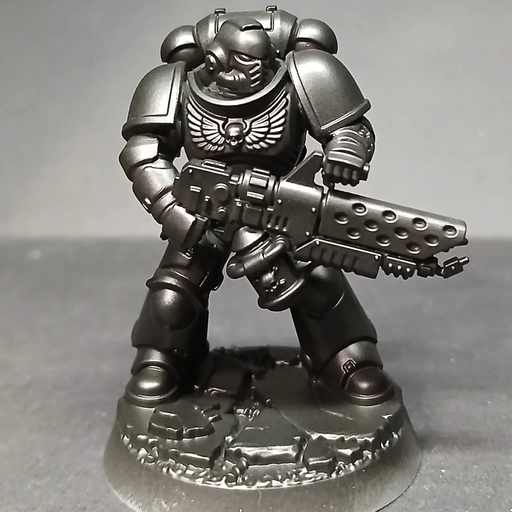
Salamanders!! A fan favorite among Space Marine Chapters, the Salamanders embody the spirit of Defenders of Humanity. Unlike many of their brothers, they’re known for putting the protection of Imperial civilians above all else—even if it means straying from their original orders. On the tabletop and in the lore, they’re also inseparable from their signature flame and heat-based weaponry, always ready to march straight into the fire for the Imperium.
In this guide, we’ll take a close look at painting their striking green armor, the hallmark of the Salamanders. To get that bold, vibrant finish, we’re starting with an approach that’s a little different from the usual “base-shade-layer” method. Instead, we’ll focus on creating contrast right from the beginning, using colors that sit opposite green on the color wheel to really make the armor pop.
I’ll be showing the first few steps with an airbrush for smooth transitions and speed, but don’t worry—if you’re working with a regular brush, you can follow along too. Just remember the golden rule of miniature painting: multiple thin coats are your best friend.
Let’s dive in and start building up that Salamanders green! Be sure to download the Astartes Salamanders Paint and Supplies List so you have everything before you begin!
Priming Your Salamanders
Start by priming your mini. Use whatever method you prefer — spray can, airbrush, or brush. For this tutorial, we used an airbrush with Army Painter Black Primer.
Establishing A True Black Base
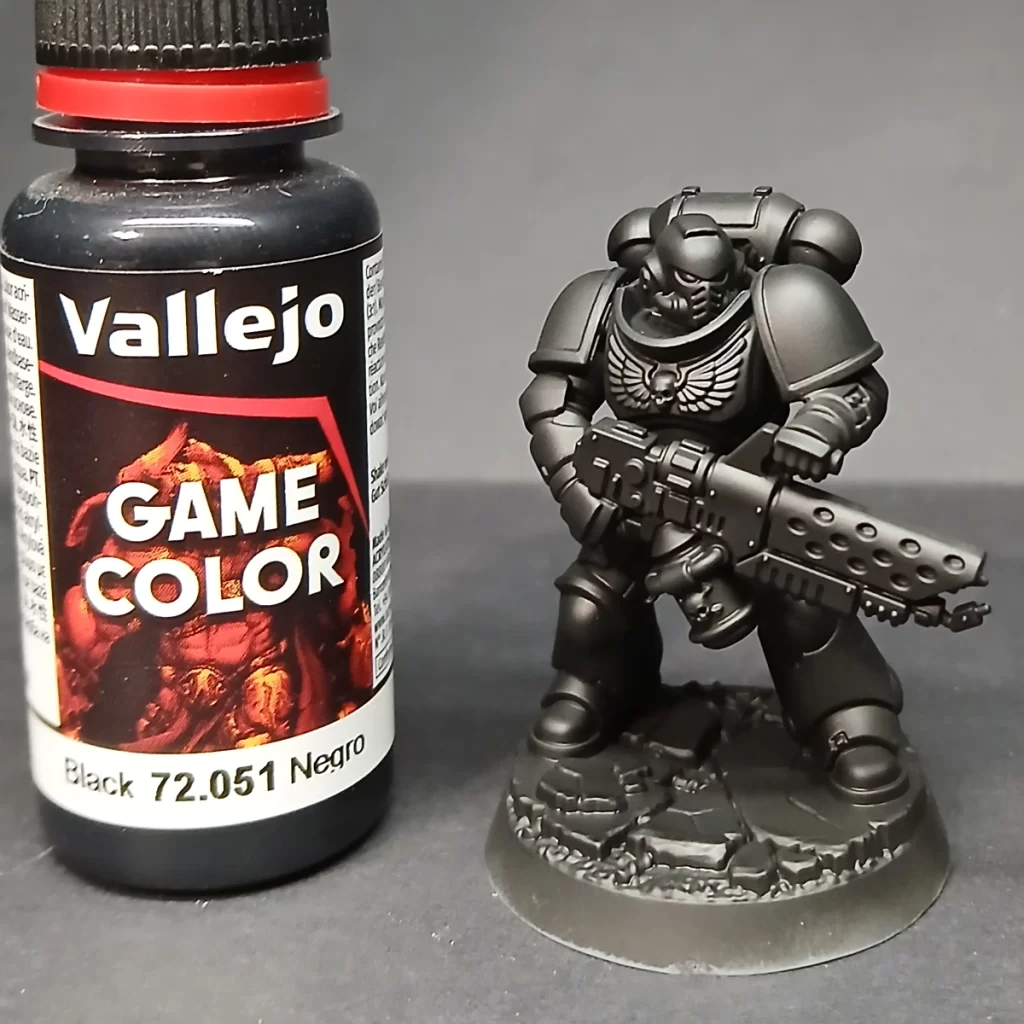
After priming, give the miniature a quick coat of Matte Black paint (Army Painter or any equivalent). This ensures the whole model has a consistent, uniform black surface. Primers and model paints don’t always match perfectly in finish or tone, so this extra step keeps your colors even and predictable once you start layering. (Fun little fact!)
You could think of this as part 2 of your priming step, and again, we applied this color with an airbrush.
Build Shadows with Contrasting Undercoat
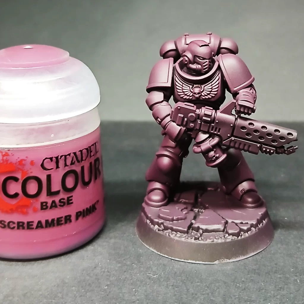
To give the green armor richer depth later, start by laying down a strong shadow color from the opposite side of the color wheel. Here, two thin coats of Screamer Pink create a bold underlayer that will make the greens feel deeper and more vibrant once applied.
🎨 Why This Works: Complementary Shadows
When you undercoat with Screamer Pink and layer Warpstone Glow on top, you’re using a trick from color theory: complementary contrast.
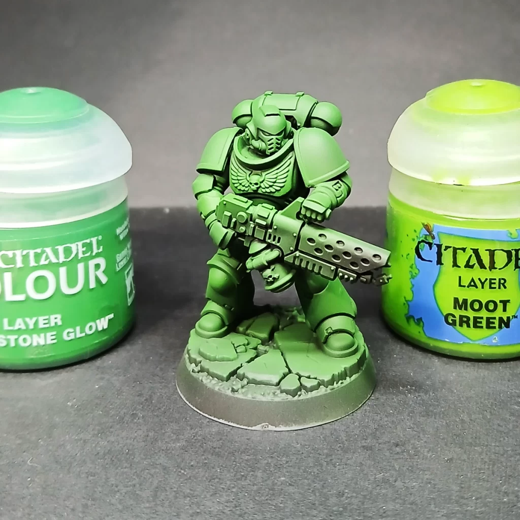
Screamer Pink (pink/magenta) and Warpstone Glow (green) sit opposite each other on the color wheel. When they interact, they naturally make each other appear more vibrant.We start by applying two thin layers of Warpstone Glow, establishing the mid-tone base that we’ll build up from. Using an airbrush makes this step smoother and more even, but a regular brush works fine as long as you keep the coats thin. Thanks to the Screamer Pink undercoat, the green gains extra depth right away, and you’ll find it needs fewer layers compared to painting directly over a matte black primer.
By spraying the Warpstone Glow in the next step, you leave Screamer Pink in the shadows. The eye blends the two, reading the shadows as deeper and richer, which makes the highlights feel brighter.
The result is a vivid green armor with natural depth, before you even start edge highlights or shading washes. Imagine, for comparison, what the green would look like if we just painted it straight over the matte black – the eye would read the green as dull, flat (lacking depth), and more coats would be required for coverage leading to chalky, clumpy looking paint and/or detail loss.
In our next step we will give the whole model a couple of layers of Warpstone Glow to set the mid-tone base layer that we’re going to work up from. We’re still using an airbrush in these steps.
Building the Green Basecoat

We start by applying two thin layers of Warpstone Glow, establishing the mid-tone base that we’ll build up from. Using an airbrush makes this step smoother and more even, but a regular brush works fine as long as you keep the coats thin. Thanks to the Screamer Pink undercoat, the green gains extra depth right away, and you’ll find it needs fewer layers compared to painting directly over a matte black primer.
Building the Green Layers Before Highlight
Mix Warpstone Glow and Moot Green in a 2:1 ratio, then layer it onto the raised edges and flat surfaces that naturally catch the light. If you’re airbrushing, apply a single thin coat at a 45° angle for a clean, vibrant pop of color.
This is where we’re finished with the airbrush and switching to a size 1 brush to begin our highlights. These past steps, up to this point, are a great way to practice using your airbrush, if you’re a beginner, without risking making detrimental mistakes.
Layering the Armor Panels for Color Emphasis

Next, use a brush to begin edge highlighting with the same 2:1 mix of Warpstone Glow and Moot Green, focusing on the top and side edges of every armor panel. This step can be extensive, but patience here really pays off with a sharp, polished finish. It’s also an excellent opportunity to practice clean layering techniques. To keep the process enjoyable, queue up a podcast, audiobook, or some music while you work.
Beginning the Highlights

For this stage, refine your highlights with a 2:2:1 mix of Warpstone Glow, Moot Green, and Ushabti Bone. Apply the mix along the upper edges of the armor, focusing on corners and key details you want to emphasize—such as the head—to naturally draw the eye.
Use your painting light as a guide to layer this mix on flat panels where the light would fall most strongly. Pay attention to your intended light source, whether it’s a top-down effect or angled at 45°, to keep the highlights consistent and convincing.
Notice in the picture we layered areas such as the top of the head, arms, boots, and shoulder pads with this slightly lighter color to add foundations to our highlights.
Pushing the Armor Panel Highlights
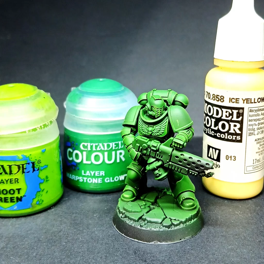
The final highlight is a 1:1:1 mix of Warpstone Glow, Moot Green, and Vallejo Ice Yellow. Apply this sparingly to the sharpest edges, concentrating on the corners of armor panels. By tapering the highlight toward corners, you create focal points that enhance the model’s readability while maintaining overall color cohesion. The aim is to achieve crisp, punchy division lines without overwhelming the green—go too far, and the highlights will push the armor toward yellow instead of accentuating its form.
Pinpoint Highlights
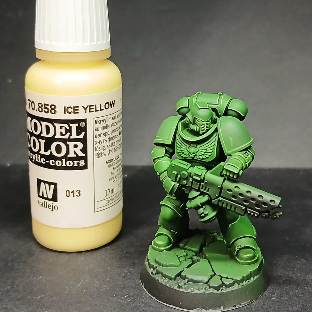
The last highlight is applied with pure Ice Yellow, but only as the tiniest dot placed on the sharpest corners—where two edges meet. This subtle touch creates a spark of visual interest, guiding the eye naturally across the model and reinforcing focal points without overwhelming the overall color scheme. It’s a small detail, but it adds a lot to the model’s readability and finish.
Shading the Armor with Glazes
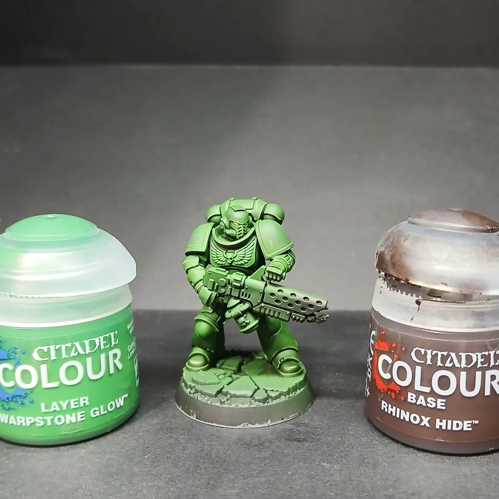
To shade the armor, mix Warpstone Glow and Rhinox Hide in a 1:1 ratio, thinning it down to a glaze consistency. Test the mix on your thumbnail—if it leaves a very transparent but noticeably darker tint, you’ve got it right. Remember, this should be thinner than a wash.
Apply the glaze into the deep recesses of the armor and toward the lower sections of larger panels, like the legs. Building up 3–4 layers in this way creates depth and contrast, preventing the armor from reading as a flat block of bright green. With each pass, concentrate more on the darkest corners and layer deeper within the previous glaze to form a smooth gradient.
Pro Tip: Pull the brush toward the area you want darkest. As the glaze dries, more pigment settles at the end of your brushstroke, helping you naturally build shadows without tide marks.
Finishing the Armor: Shoulder Pads
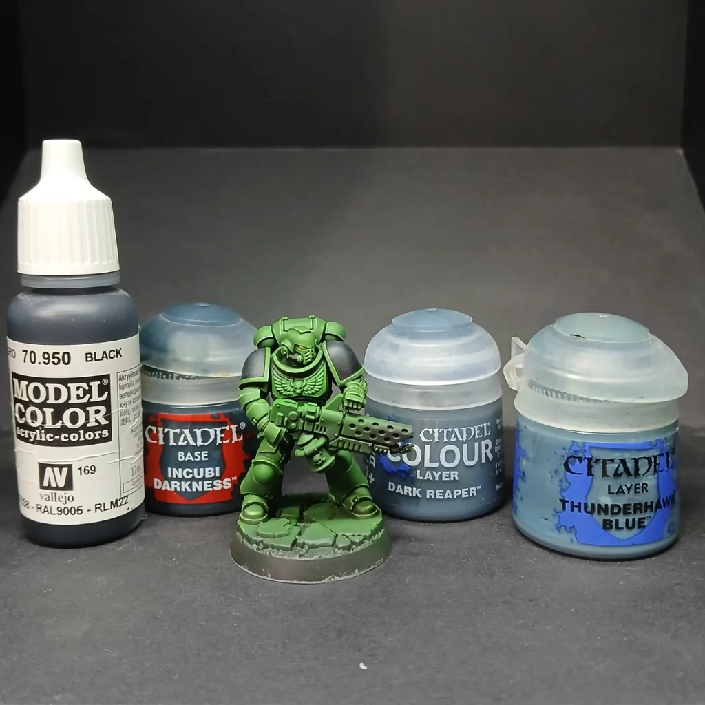
For the final step, return to black (from the model’s basecoat) to paint in the shoulder pads. To highlight them, build up a soft transition using a stippling technique with Incubi Darkness, Dark Reaper, and finally Thunderhawk Blue. Apply each successive color toward the top of the pad, placing it within the center of the layer before to create a smooth gradient. This subtle highlight helps the black read as textured armor rather than flat paint, tying it neatly into the rest of the model.
Optional Edge Highlight: For extra definition, lightly edge the top rim of the pad with Fenrisian Grey or a very thin blue-white mix. This small accent sharpens the silhouette and adds more contrast, especially effective under strong lighting.
Into the Fires of Battle

And there you have it—your Salamander should now boast slick, smooth, and striking green armor that commands attention on the tabletop. With bold contrast and refined highlights, it’s a scheme that’s sure to impress allies and intimidate opponents alike. Go forth, Brothers—into the fires of battle and unto the anvil of war!
No responses yet