Mythic Minis is reader-supported. When you buy through our affiliate links, we may earn a small commission—never costing you anything extra. Your support helps us keep creating helpful painting guides and hobby resources for everyone.
Choosing the right colors for your miniatures is more than just picking your favorite shades—it’s about telling a story, creating visual harmony, and guiding the viewer’s eye. In this post, we’ll walk through the exact paints and decisions used to bring a Stormcast Eternal Vindictor to life, using the principles from our Color Theory Guide.
1. Establishing a Dominant Color: Blue Armor
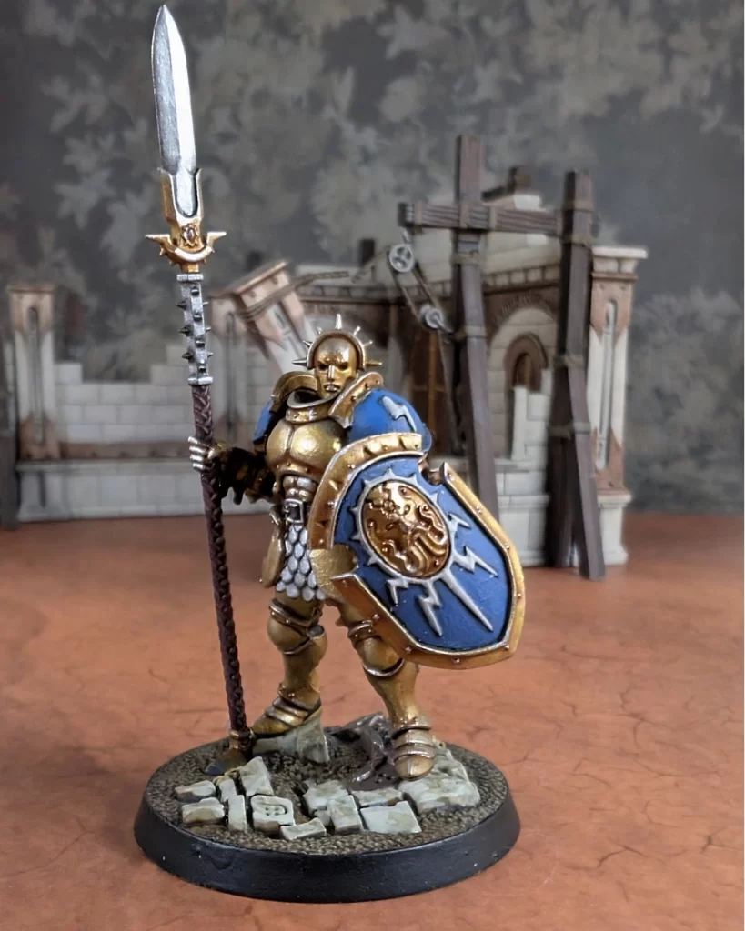
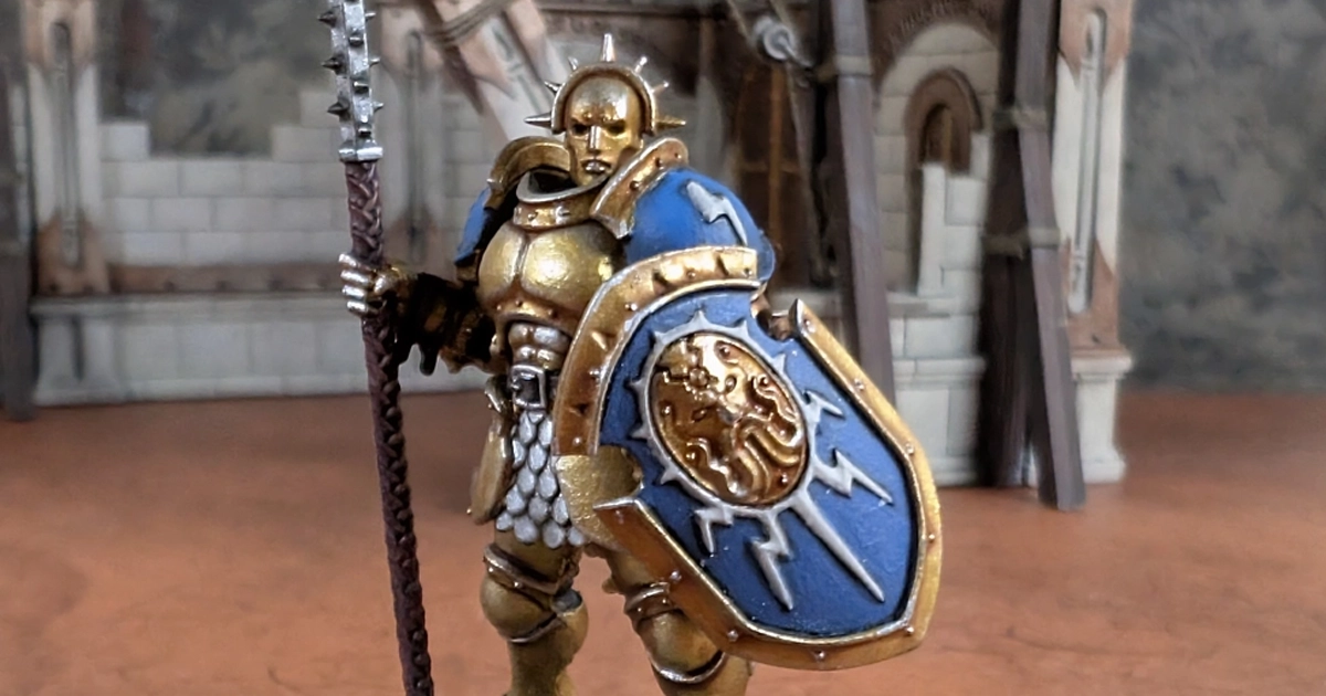
The first step in applying color theory is identifying a dominant hue. For this Stormcast Eternal Vindictor, the rich blue of the shoulder pads establishes a cool, commanding presence that contrasts beautifully with the warm metallic gold of the armor.
Paints used:
- Kantor Blue (base)
- Nuln Oil (shade)
- Alaitoc Blue (mid-tone)
- Teclis Blue (highlight)
This analogous blue gradient creates depth and consistency while remaining visually soothing.
2. Warm vs. Cool Balance: Gold Armor & Accents
The gold armor provides a brilliant warm counterbalance to the cooler blues. This use of warm metallic paints ensures visual energy and communicates the strength and nobility of the Stormcast.
Paints used:
- Retributor Armor
- Reikland Fleshshade
- Auric Armor Gold
- Stormhost Silver (for final highlights)
This warm tone balances out the cool blues and prevents the model from feeling too cold or flat.
3. Using Neutrals to Ground the Palette
Neutrals like black, brown, and parchment are essential for balance and realism. These areas provide visual rest and keep the model from becoming too chaotic.
- Parchment Areas (tabards, scrolls): Rakarth Flesh, Nuln Oil, Karak Stone, Pallid Wych Flesh
- Fabric Joints (black): Abaddon Black, Nuln Oil, Eshin Grey, Dawnstone
- Browns (belt, sheath, shield handle): Dryad Bark, Nuln Oil, Gorthor Brown, Baneblade Brown
By keeping these areas neutral, the eye is naturally drawn to the armor and weapons—your primary focal points.
4. Accent Colors: Pink Details for Personality
To give the model personality and break up the dominance of gold and blue, unexpected pink accents were added to the spear and sword handles.
Paints used:
This adds a touch of boldness and helps differentiate this miniature from standard box art without overwhelming the palette.
5. Metallic Contrast: Silver Details
The weapon blades, belt buckle, and scale skirt use cool silver tones to reflect light and add sharp contrast to the otherwise warm armor.
Paints used:
Silver reads as “cool” in color theory and complements the gold armor while tying into the cooler blues on the model.
6. Creating Focal Points
Using contrast and saturation, the focal points of this model are clearly the face, shoulder pads, and weapons. Here’s how the color choices helped:
- Brightest highlights are focused on the upper torso (shoulder pads, face area).
- High-contrast edges are found on weapons and armor trim.
- Muted colors (neutrals) draw attention away from non-essential areas like joints or accessories.
Final Thoughts
This Stormcast Eternal Vindictor demonstrates how thoughtful color choices—rooted in basic color theory—can create a cohesive, visually striking miniature. By balancing warm and cool tones, using neutrals strategically, and adding accents for personality, you can elevate your painting from good to exceptional.
We’ve learned what colors are complementary for maximum contrast and what colors match analogously with others for a tasteful color scheme.
We’ve also learned that our base coats, layers and highlights can use secondary and tertiary colors to analogously tie into accessories and details on the model and remain exactly complementary to their counterpart colors.
I had some epiphanies myself when writing this, so don’t get too discouraged if you’re not following. In the end, use your eyes and your gut to tell you what looks good and what doesn’t. And in the end, it’s what you like that matters!
Happy Painting!
Next Steps
Hopefully, you’re inspired and have some colors picked out. It’s time to build your model!


No responses yet